My parents have a clock shaped like a fish. It’s hideous but they love it. It works because, despite being shaped like a trout, the people who look at it know what it means when the hands point in their respective directions. A clock face may traditionally be round, but for someone who can tell the time on an analogue clock face, any shape will do, leaving makers free to indulge their imaginations.
The same cannot be said of the wheel. The wheel is round because that’s the only shape in which it functions. Granted, a car with wheels in other shapes could be made to look amazing, but it wouldn’t drive very well. A car built with any other shape of wheel wouldn’t fulfil its primary function of offering transport. It would be nothing more an ornament; an object born of vanity.

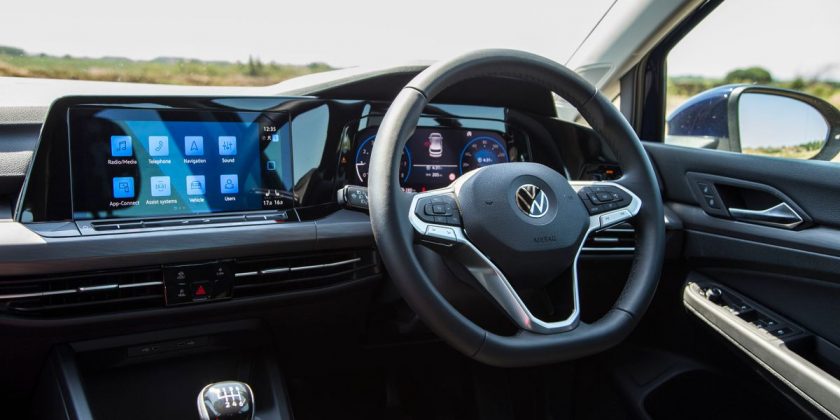
Of course, this idea is stupid. No one would be daft enough to design car technology that overlooks such obvious and primary concerns, would they? Err, actually, yes. Most car makers would, and already have done: we’re talking, of course, about the trend for the massive touchscreens – Mercedes is now up to 1.4 metres with its latest – that are increasingly replacing traditional dial-and-button-based layouts. They’re put in there for two reasons: because they’re materially cheaper to make, and because they appeal to buyers’ vanity.
Let’s paint this picture in detail. The customer steps inside the shiny showroom, huge tie knots emerging from behind every desk and an overpowering hit of Armani manfume scorching their nostrils. They’re escorted to a new model and climb in. Gasp! Such a wonderfully large and bright giganto-touchscreen. Look at all the things it can do! I can get Spotify on here, and maps, and my emails, and – oh yes, I’ll take it, thanks.
Big screens in cars – which are, thankfully, still people’s personal space – are designed to give access to your digital personal life, which is becoming an ever-larger part of people’s perceived personalities. In layman’s terms, having access to all their apps at all times is a big deal for people. It makes them feel connected, which is a crafty way of rephrasing the real truth that it makes them feel important: involved. Noticed. Validated.
During the conversation with the unnervingly well-groomed 21-year-old salesman whose mind is already on his bonus, none of the practicalities will come to mind for our poor, ignorant customer. For example, the fact that while driving down any normal road, there’s often too much bumpiness to be able to accurately and quickly press the screen in the correct two-square-centimetre space. Or the fact that they attract fingerprints like chum attracts sharks. Or, most importantly, the fact that they completely distract the driver for extended periods.

The UK’s TRL, formerly the Transport Research Laboratory, carried out an initial study in 2020 on the type and length of distractions caused by touchscreens. It found that choosing a track on Spotify had drivers looking away from the road for as much as 20 seconds. Anyone whose imagination isn’t filling in the terrifying blanks as to what might happen in such a long gap should surrender their driving licence before they kill someone. Speaking to Autocar recently, Neale Kinnear of TRL proposed the idea of an NCAP-style test but for distractions behind the wheel.
Car makers have a responsibility to provide technology that doesn’t create distractions; that doesn’t require lengthy gaps in watching the road. That technology is the button, and the rotary dial. A glance away from the road is all that’s needed; sometimes not even that. Choosing a music track can still be complex but it’s arguably faster by dial if you’re also driving at the same time. Faster and safer, because you can keep looking back at the road while your hand stays on the control.

We’ve no problem with the use of beautiful displays in cars, but making them touch-input is like making non-round wheels. They’re dangerous, impractical and appeal only to negative personality traits. Yes, big touchscreens are pretty and bright and colourful, and they let us check our apps if we want, but as manufacturers, consumers and human beings we need to be better than that before research needs to be done on how many deaths and accidents are actually caused by these distractions. Pretty or not, it’s time for us all to switch off to in-car touchscreens.
Source: Read Full Article

