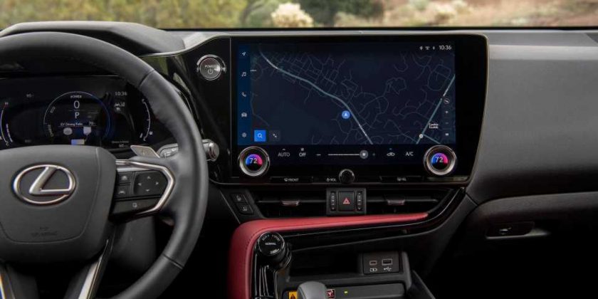
As anybody who has lived with or read a review of a new Lexus product over the last decade or so will attest, Toyota’s luxury brand has an infotainment problem. Whether it’s the mouse-like Remote Touch controller or the not-quite-like-a-laptop touchpad that followed, controlling the audio and navigation functions in a modern Lexus product has been, more often than not, a pain in the ass. Well, Lexus has heard the complaints and is finally addressing the criticism, because debuting inside the all-new 2022 Lexus NX crossover—my driving impressions of which you can read here—is a massive and massively overhauled infotainment system that aims to bring the brand’s onboard screens into the current decade.
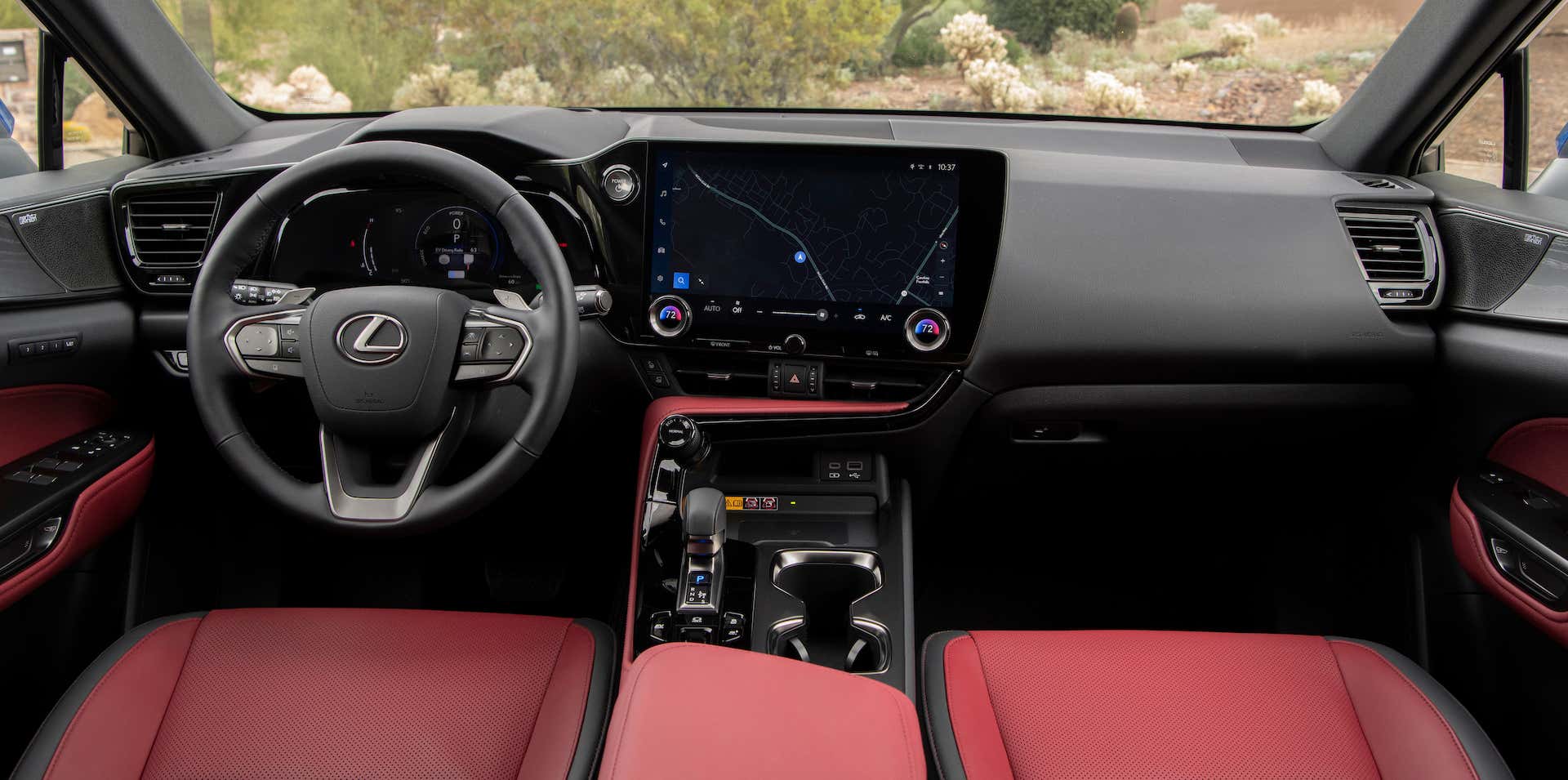
Here are the baseline facts. As standard, the new Lexus NX comes with a 9.8-inch touchscreen running brand-new software officially called “Lexus Interface.” Optional, however, is the larger 14-inch display that we suspect most buyers actually want and, incidentally, the only one Lexus had on hand at its NX drive event to test.
The system was developed in North America with the North American market in mind and will eventually come to other products not just in Lexus’ future lineup, but in parent company Toyota’s as well. In fact, it already has done so in the new Tundra pickup, which uses a differently skinned version of this same system.
Finally, Some Good F—ing Apps
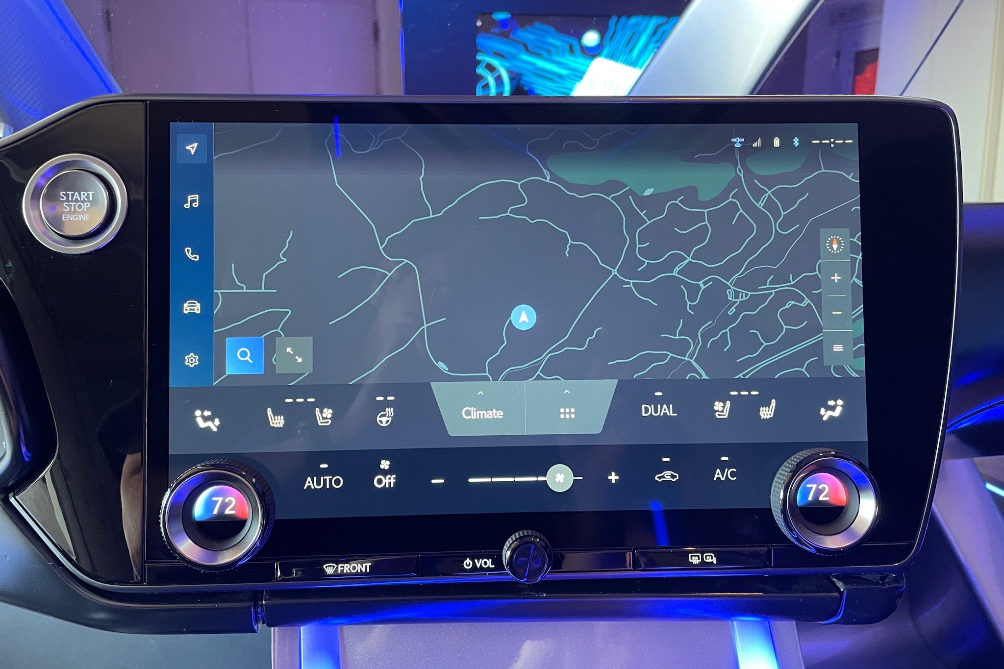
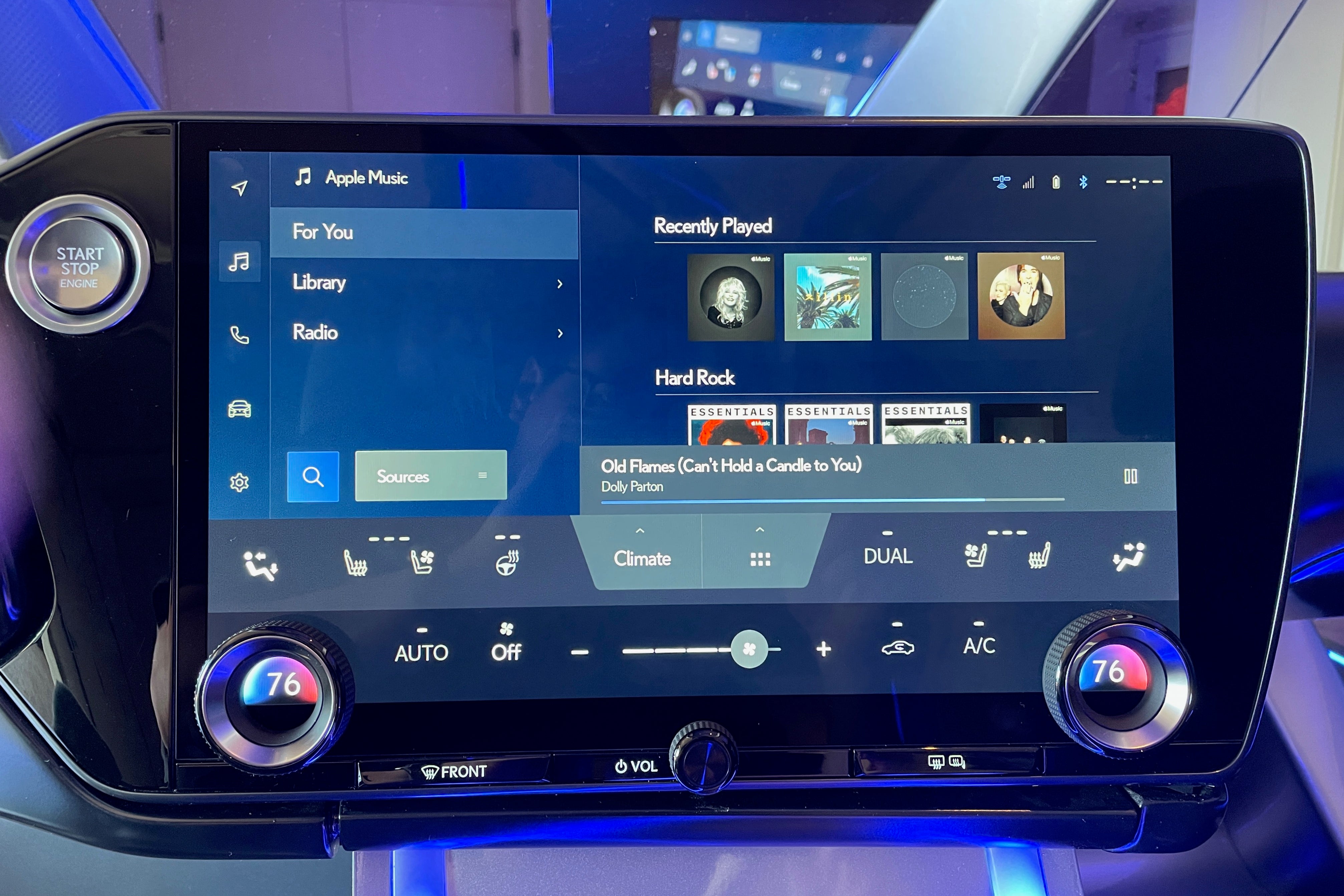
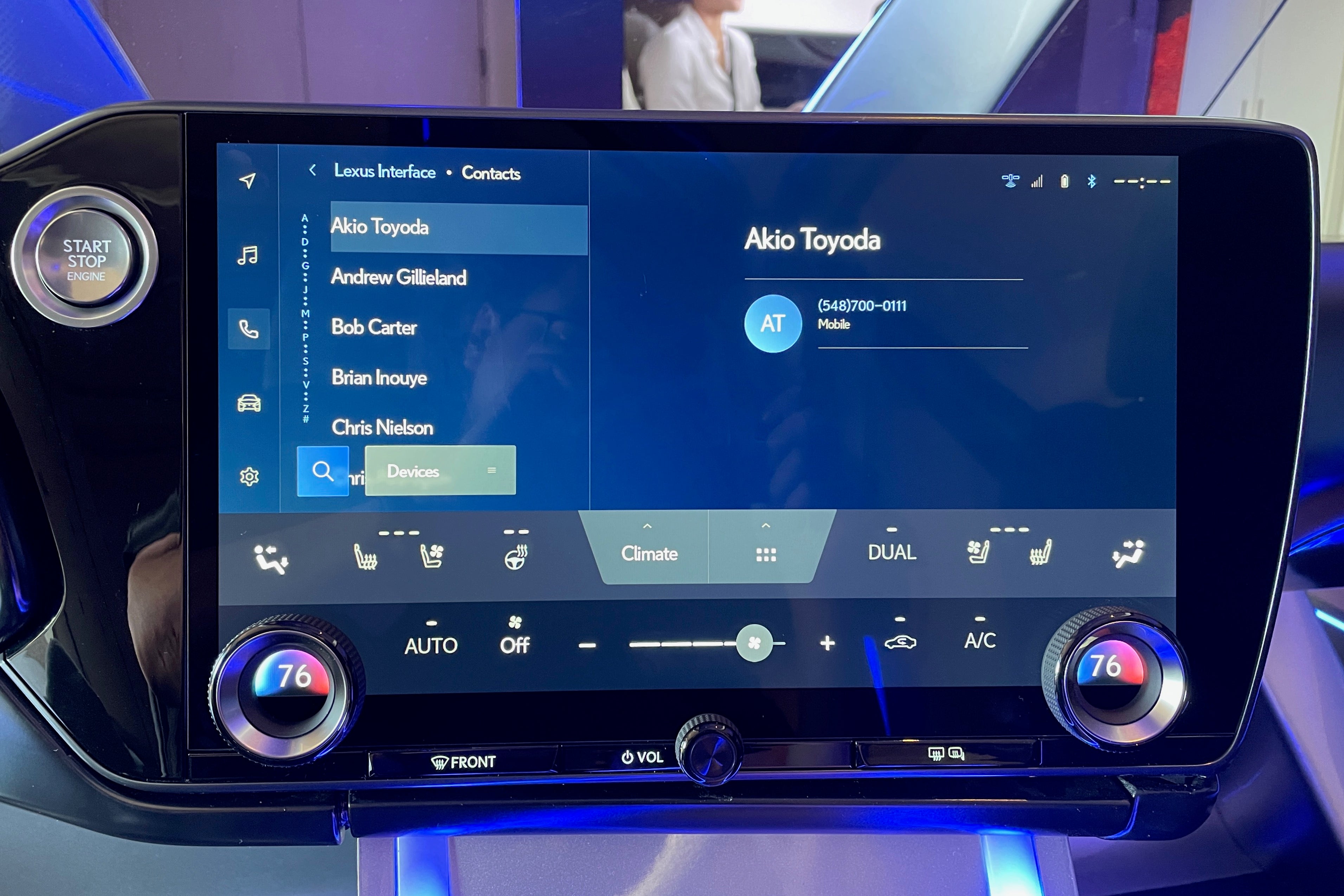
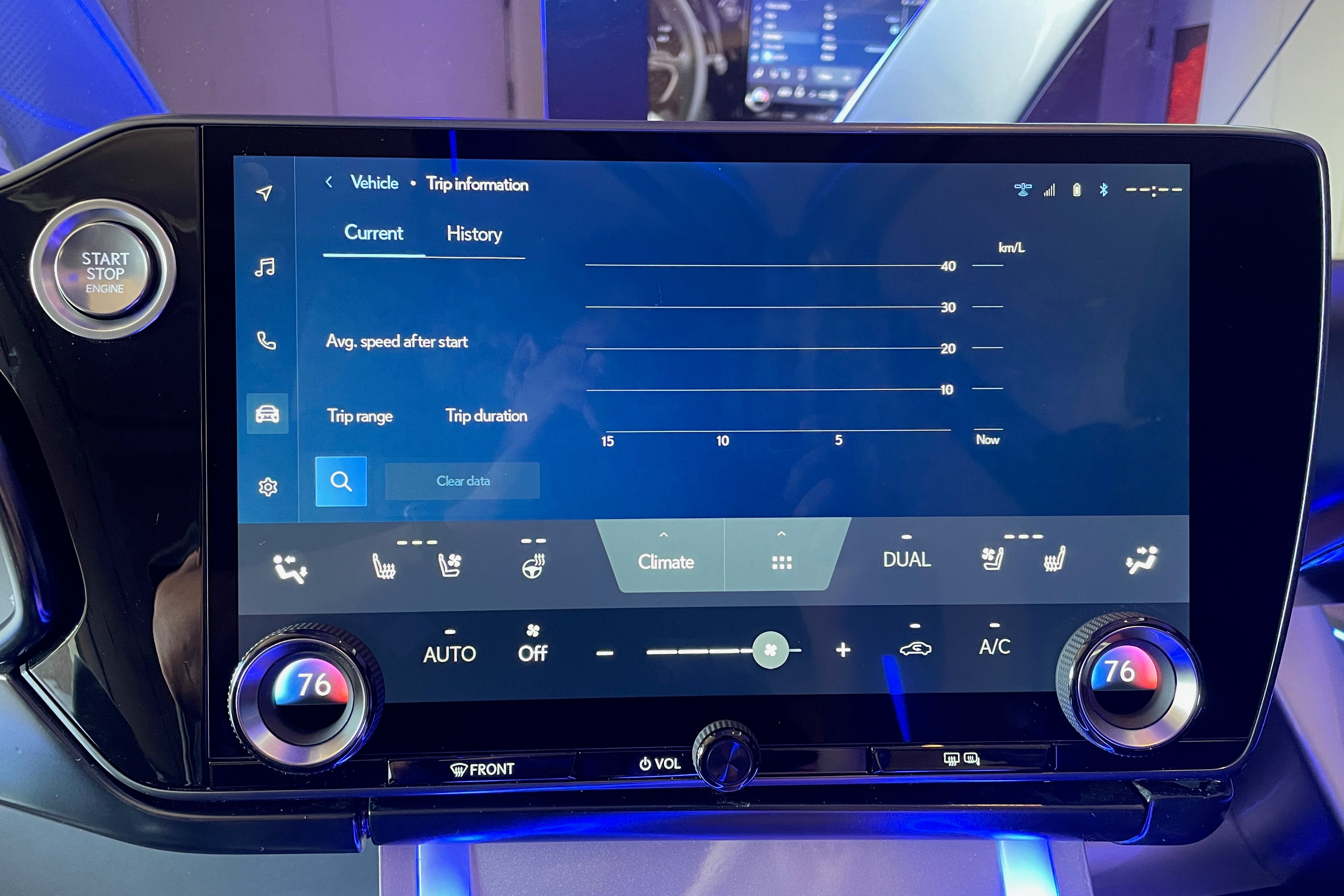
Right off the bat, this new system is objectively a vast improvement over Lexus’ old interface—not just because it no longer relies on some convoluted, physical input device not found in any other consumer electronic device but also because the new layout is simpler and runs on a much bigger canvas. Taps and swipes are responded to smoothly and snappily, and, much like BMW’s very good iDrive system, five icons lined up vertically on the left side (close to the driver) let you quickly switch between navigation, media, phone, vehicle controls, and settings. Unlike the outgoing Lexus software, the built-in navigation and audio applications feel modern, conveniently laid out, and not all that different from a map or streaming app you’d install on your phone.
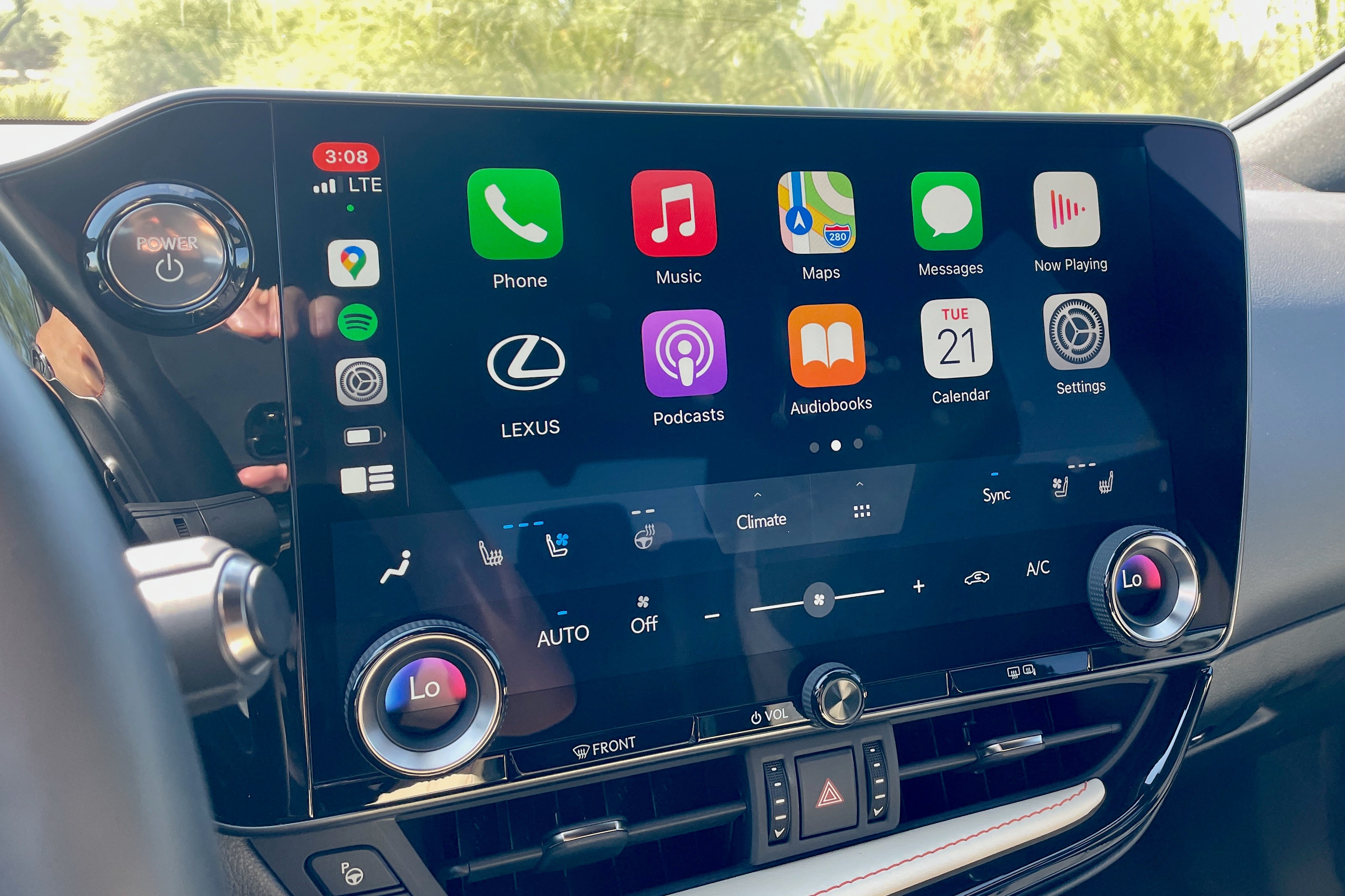
Speaking of, Apple CarPlay and Android Auto both connect wirelessly and, in the case of the former, initialize relatively easily. The iPhone-mirroring tech takes up the top half of the display, uses the full width, keeps all HVAC controls on-screen, and works just like it does in every other car that supports it.
Hot and Cold
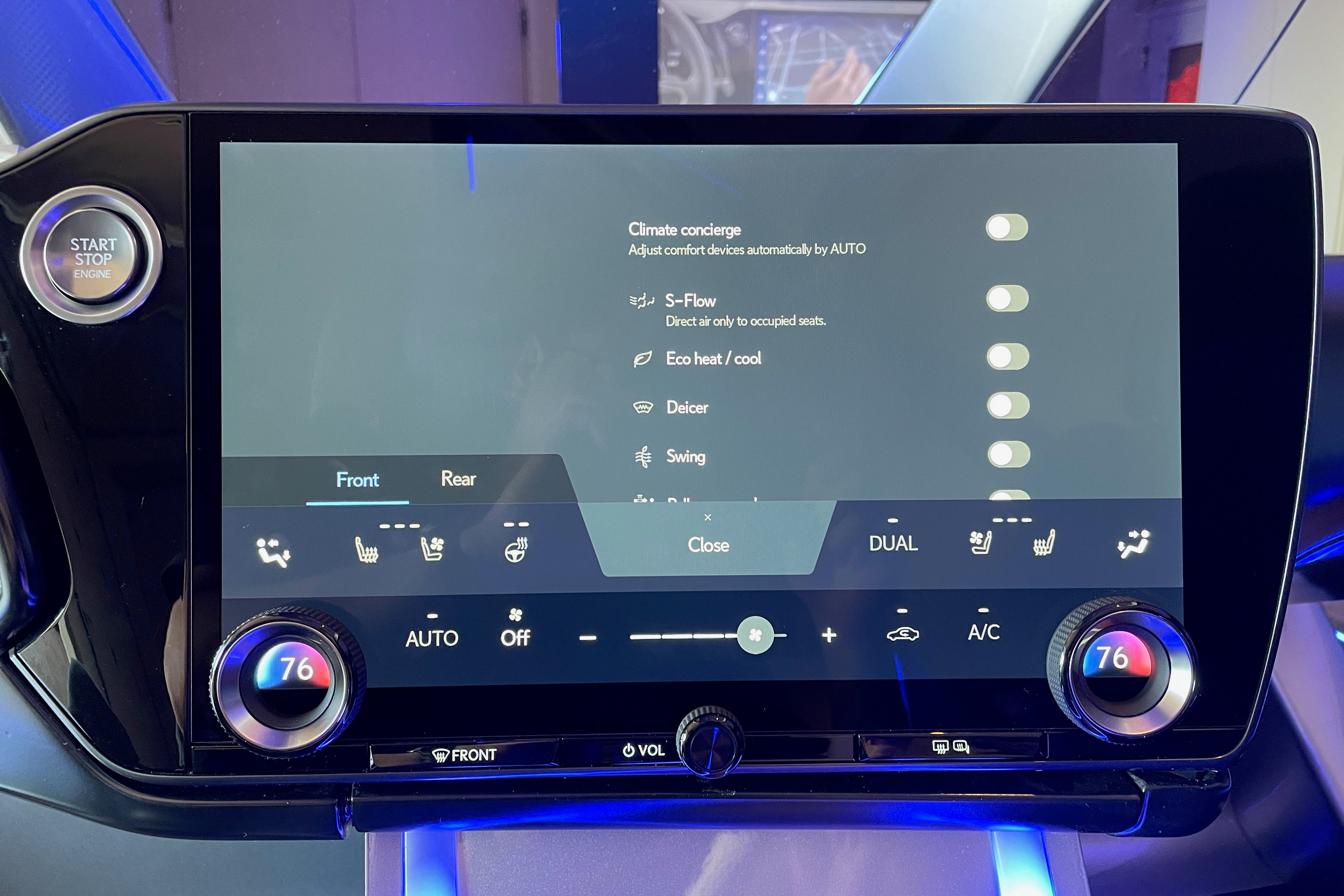
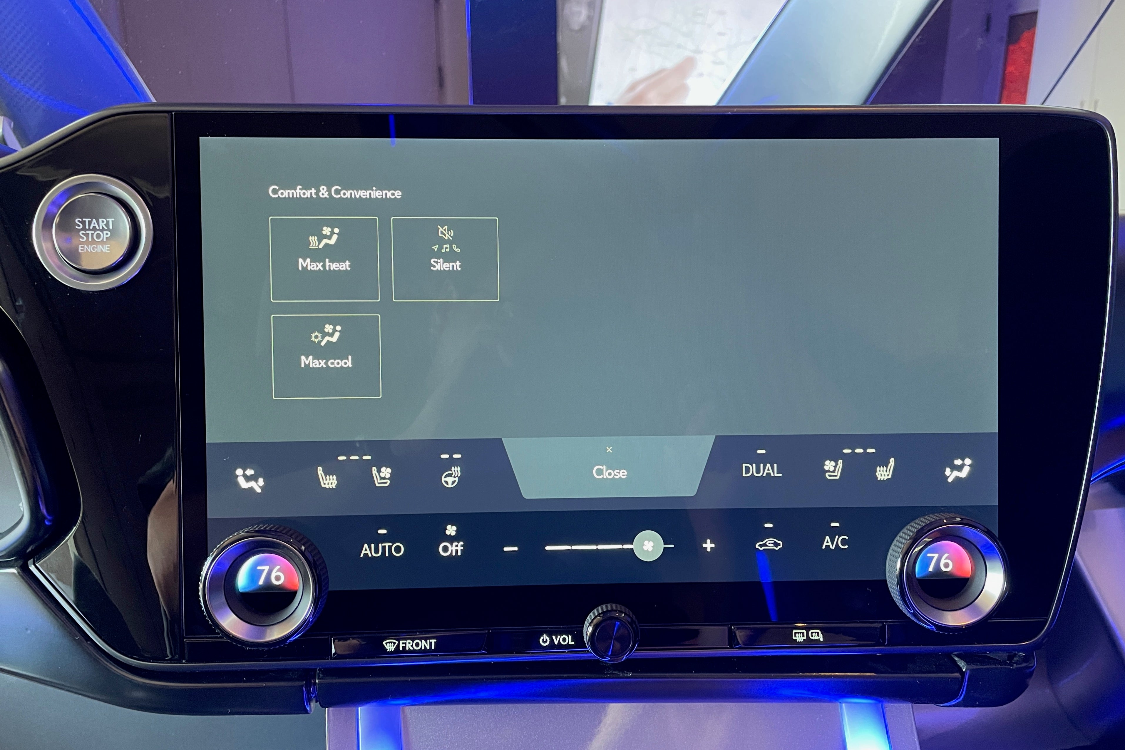
The bottom-third or so of the touchscreen is dedicated to HVAC controls most of the time, but the top half of this—the section that handles air flow, seat heating/ventilating, and the heated steering wheel—can be closed away to make the main display bigger. One function of note is a menu containing useful shortcuts to stuff like max cool, max heat, and toggles for the car’s various ADAS features, brought up by tapping the icon with the six dots.
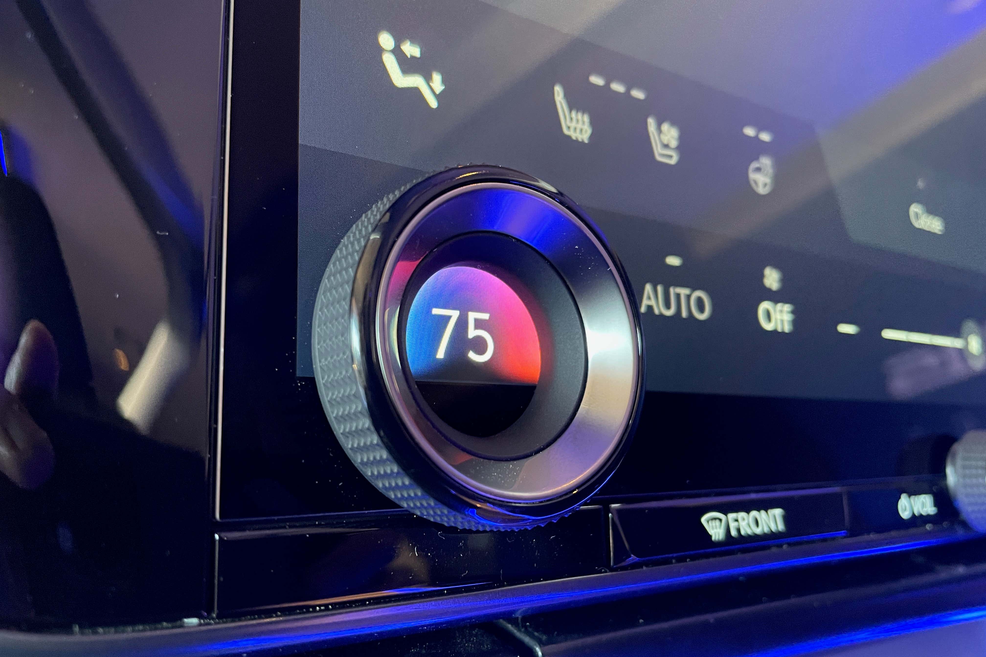
South of this is a touch section dedicated to adjusting the main climate controls like fan speed. This section, though, cannot be hidden away and is always there which kind of makes you wonder why Lexus didn’t just make this part physical instead. One possible reason, of course, is that if it did, we wouldn’t have the admittedly nifty-looking temperature knobs that have been laid on top of the screen a la Ford’s Mustang Mach-E and F-150 Lightning. (Also, knobs and buttons are generally more expensive to produce and install instead of just putting a picture on a screen.) These knobs are, aesthetically, definitely a cool touch when left alone but their actual operation leaves a few things to be desired.
First off, the movement of the knobs themselves just isn’t very satisfying. Secondly, despite the creative freedom that displaying the temperature with a full-res screen affords, the number inside of the ring doesn’t change with any sort of animation (like those on the ES do). It just… changes. And, most frustratingly, there’s about a full second of lag between the turn of the wheel and the temperature display changing. Granted, I realize these probably all fall under the category of Dumb and Inconsequential Auto Journalist Gripes, but luxury carmakers sell an experience as much as they sell automobiles. The experience these things add up to is one of an unfinished prototype.
“Hey Lexus”
In a somewhat surprisingly modern move, the new Lexus Interface also features Alexa-style voice controls. Utter the words “Hey Lexus” inside the new NX and a Siri-esque orb appears on the screen and waits for a natural-language verbal command. The Lexus assistant’s existence is appreciated but its current functionality and execution still feel very much like Version 1.0. The number of things you can do by voice alone seems, at least judging by the brief amount of time I had with it, kinda limited. It’ll do the basics like crank up the air conditioning in response to “Hey Lexus, I’m hot” or change the satellite radio station to the one you verbally specify but other, more party-trick worthy stuff like opening windows, sunshades, and turning on wipers could not be done hands-free. At the event, the company specifically confirmed to The Drive that voice-activated windows, while technically possible, won’t be coming to fruition (at least not here in the U.S,) due to safety regulations.
Oh, and unlike the “Hey Mercedes” lady in that company’s MBUX system, Lexus’ digital butler could not tell me a joke when I asked her for one.
On top of just not being all that useful, the voice-command system in its current form is quite slow. Even with basic commands like temperature change requests and finding addresses, the floating orb always seems to take several long seconds to “think” about what you just said. Just enough time and awkward silence to think to yourself, “I could’ve done this quicker with my fingers, couldn’t I?”
Early Verdict
But despite what may feel like a litany of complaints, the new Lexus Interface is a decent system and a huge step up from the one it replaces. The on-screen layout—the most crucial part of all of this—is clean and easy to wrap your head around.
That said, it does kind of feel like the slightly unrefined, very first version of… something. Because it is. The voice assistant isn’t amazing and the temperature knobs could stand to feel a lot fancier. But if those are the two biggest gripes I can come up with, Lexus’ new onboard infotainment system is probably off to a decent start.
Got a tip or question for the author about the new NX? You can reach them here: [email protected]
RELATED
2022 Lexus NX First Drive Review: One Rock Solid Little SUV
The new NX brings with it Lexus' first plug-in hybrid powertrain and an all-new infotainment system.READ NOW
RELATED
The Determined Employee Team That Convinced Lexus to Finally Drop the Touchpad
Steve Basra and Daniel Hall floated the idea of a new user interface in 2017 and it's finally in play. Here's how they did it.READ NOW
RELATED
The 2022 Subaru WRX's Base Infotainment System Is Pretty Bad
There's a lot of bezel going on.READ NOW
Source: Read Full Article
